Some of our satisfied clients
We openly share a portfolio of the work we have done in conjunction with clients who have trusted us to carry out their projects.
Scroll to see our magic


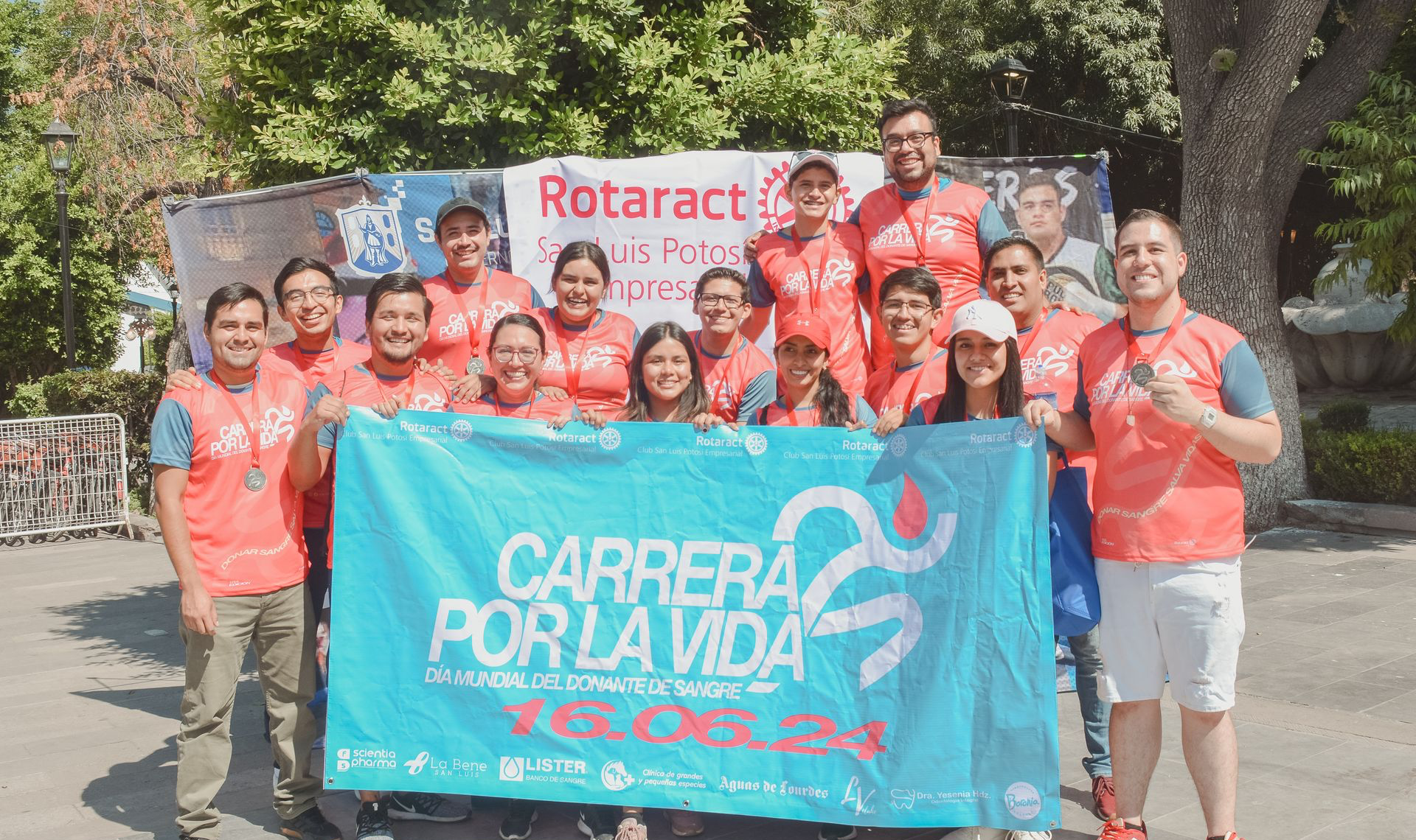
A few photos of the event


Nuestros clientes satisfechos
Compartimos abiertamente un portafolio del trabajo que hemos realizado en conjunto con clientes que han confiado en nosotros para llevar a cabo sus proyectos

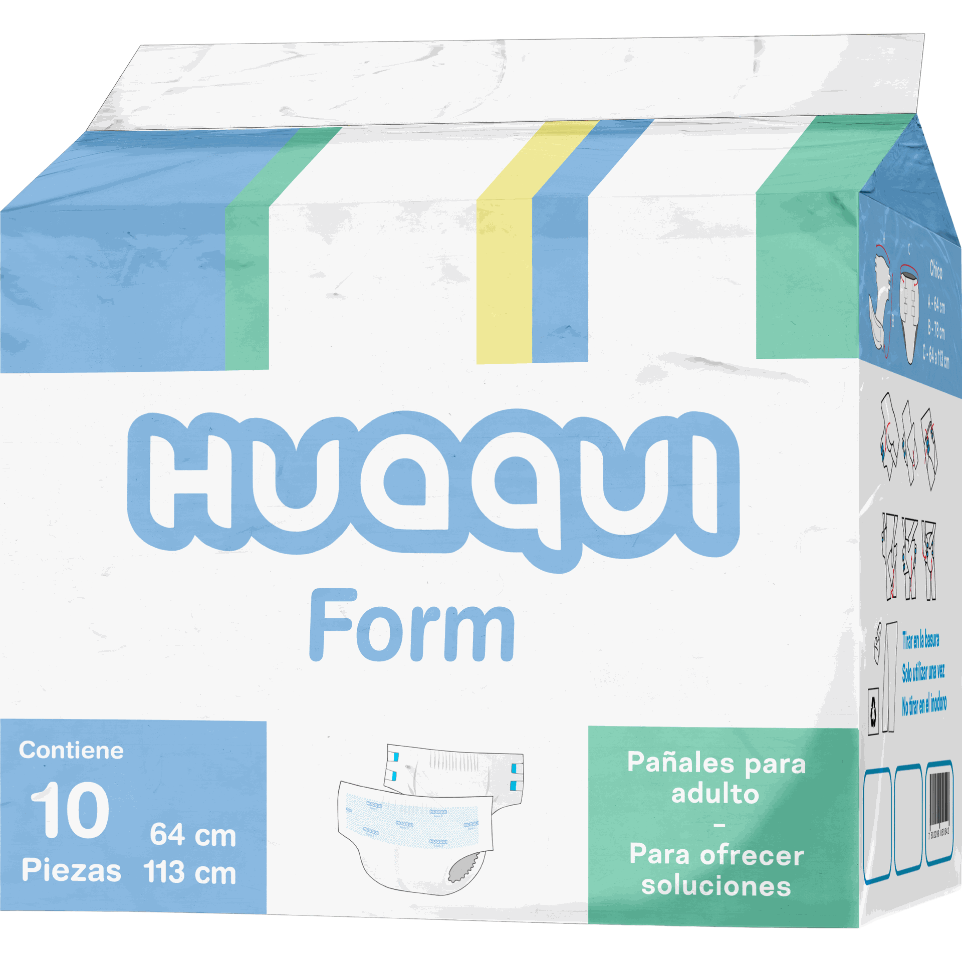
Para ofrecer soluciones

This identity was created and designed for a 100% Mexican brand that offers incontinence products for adults.
The roots of Mexico and its indigenous languages were the main focus. The name Huaqui comes from Nahuatl; meaning ‘dry’. Following a philosophy of always keeping users as dry as possible using only one product.
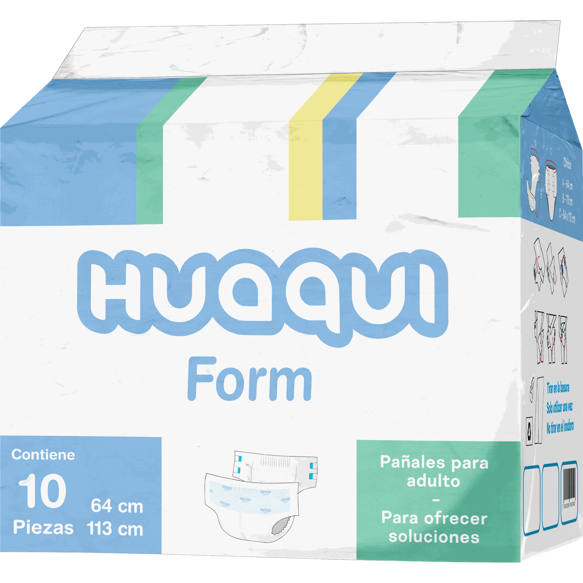
Calidad increíble con un diseño deslumbrante
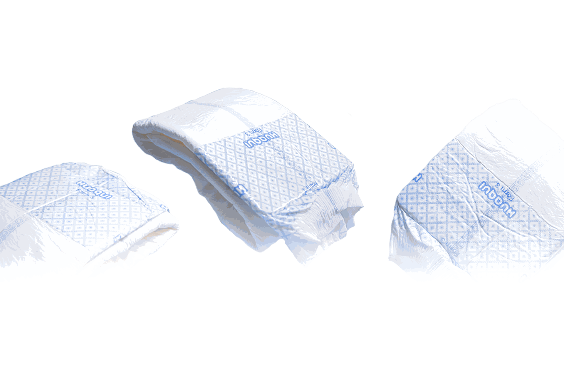

We create a coherent system across all visual media to give a positive impact to the users who come to the product. The inspiration for the colours and monograms chosen for the packaging were abstracted from the zarape, as it is a garment worn by people in the countryside and used to cover themselves from the rain.
Even the digital networks have been carefully designed to correctly express the brand's representative colours.
With this we create a visual connection with the users reflecting security.
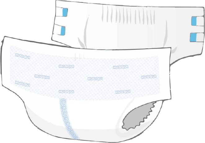
Huaqui es una marca creada por y para personas con incontinencia. Para limitar el impacto de esta condición sobre la calidad de vida, ofrecen soluciones de muy alta calidad a precios accesibles. Además de trabajar arduamente para eliminar el tabú.


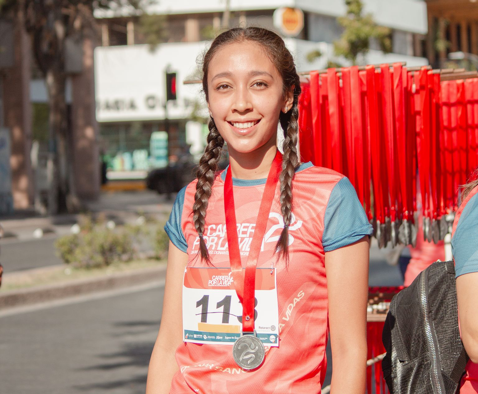
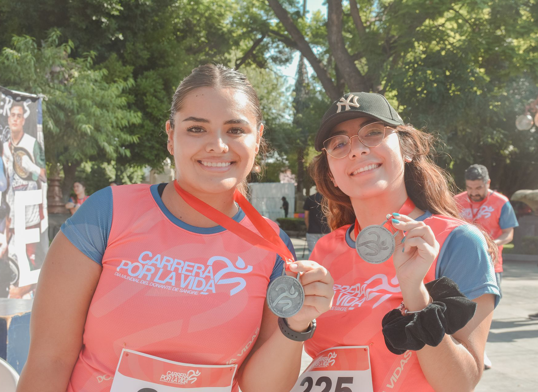
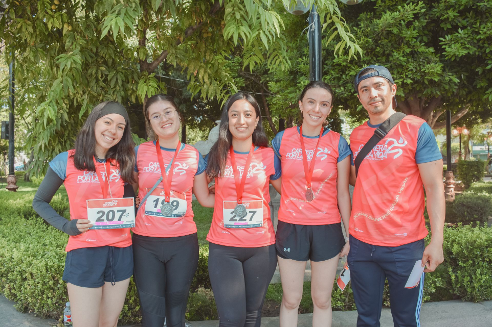
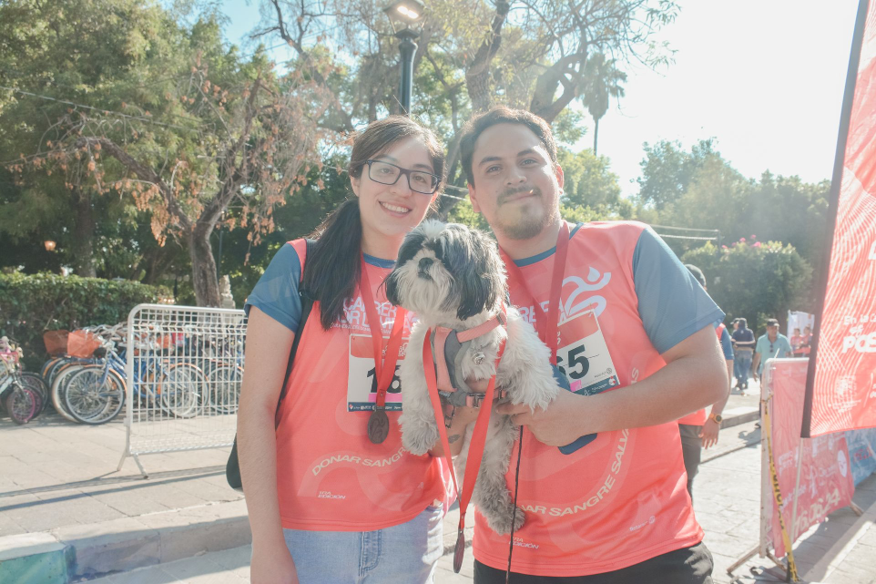
Corre por la roja
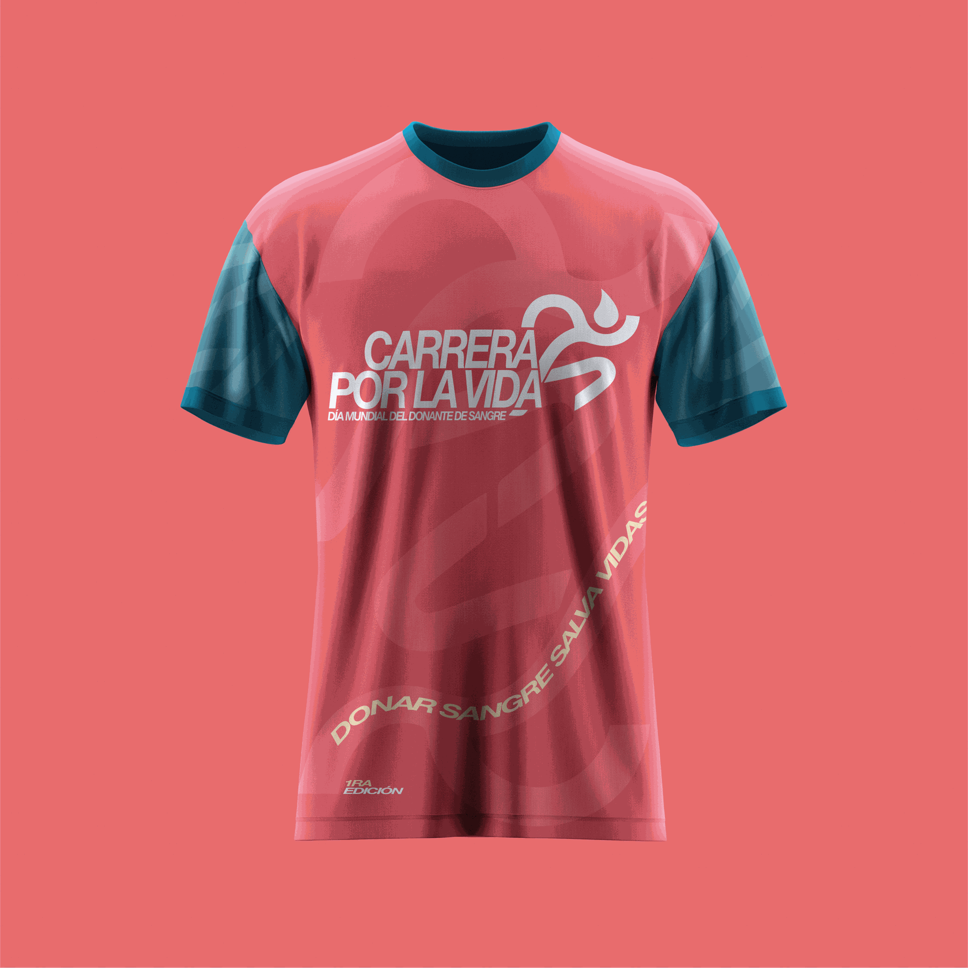
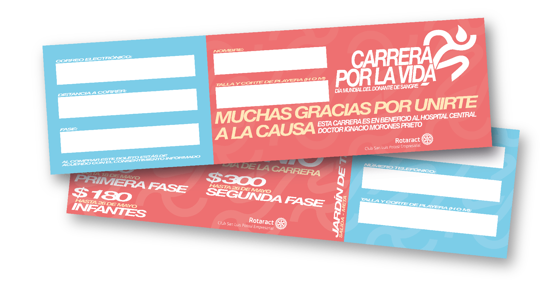
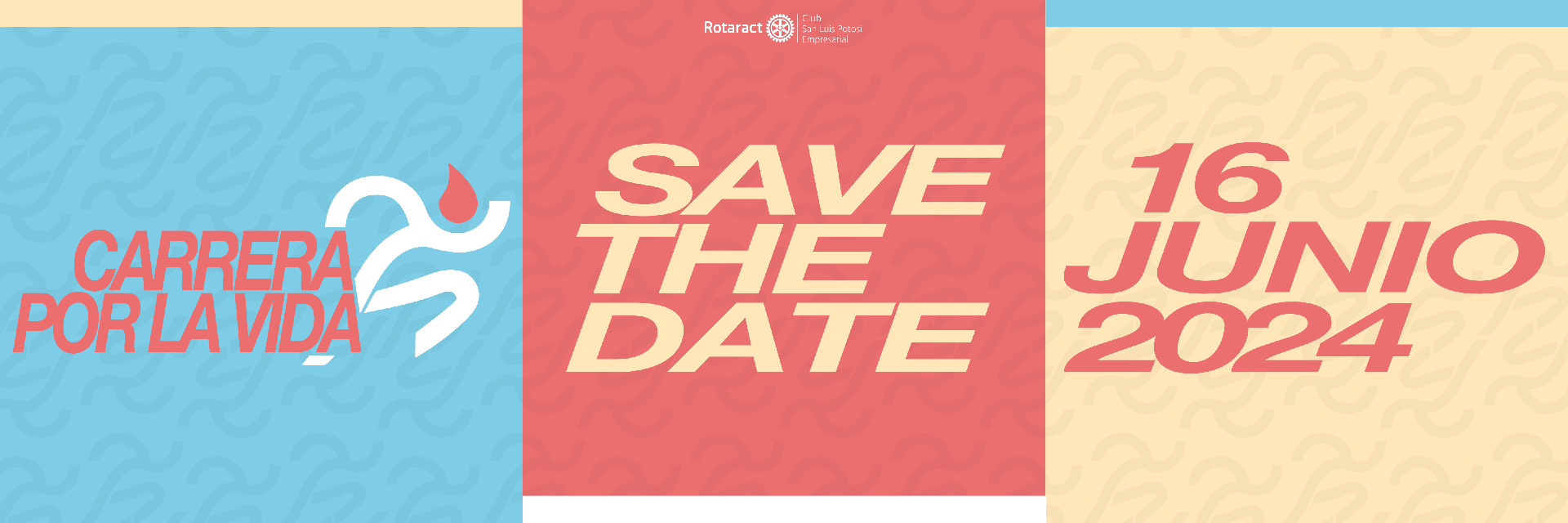
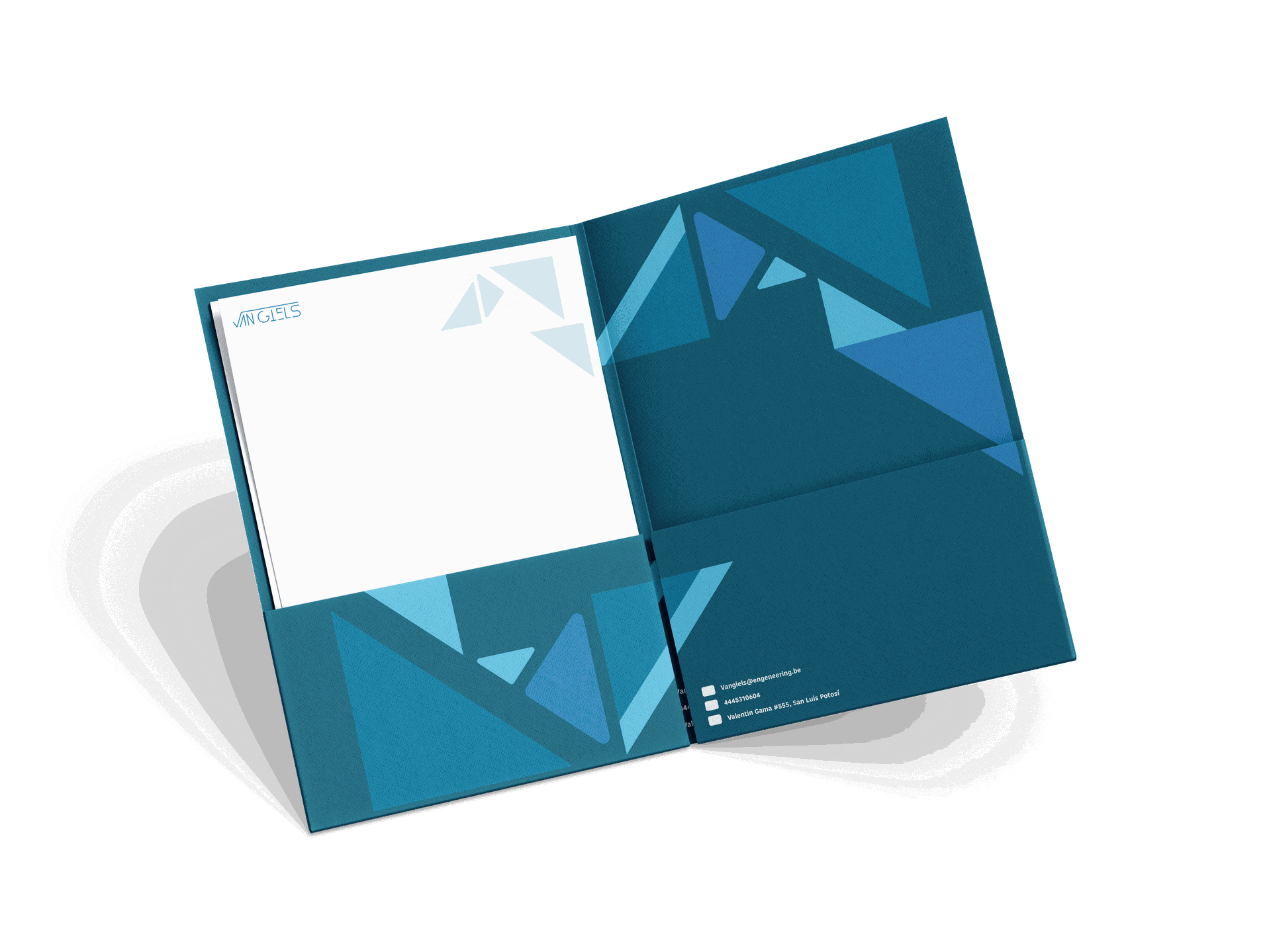
Esta marca de identidad fue creada para un Club Rotaract (San Luis Potosí Empresarial) Consistió en la realización de una carrera atlética para concientizar y visibilizar la donación altruista, así como una recaudación de fondos con el objetivo de surtir de material médico necesario para el Hospital "Dr. Ignacio Morones Prieto", este mismo como beneficiario.
Creamos la identidad gráfica de la carrera, desde el imagotipo, la publicidad para redes sociales, los boletos, playeras y mucho más.
Los colores fueron inspirados principalmente en los aparatos que son usados para las transfusiones de sangre. Así como el dinamismo de un atleta al correr. Con estas formas logramos crear una fuerte consistencia en el sello distintivo de la carrera.


Unas cuantas fotos del evento

Para ofrecer soluciones

This identity was created and designed for a 100% Mexican brand that offers incontinence products for adults.
The roots of Mexico and its indigenous languages were the main focus. The name Huaqui comes from Nahuatl; meaning ‘dry’. Following a philosophy of always keeping users as dry as possible using only one product.
Calidad increíble con un diseño deslumbrante
We create a coherent system across all visual media to give a positive impact to the users who come to the product. The inspiration for the colours and monograms chosen for the packaging were abstracted from the zarape, as it is a garment worn by people in the countryside and used to cover themselves from the rain.
Even the digital networks have been carefully designed to correctly express the brand's representative colours.
With this we create a visual connection with the users reflecting security.
Huaqui es una marca creada por y para personas con incontinencia. Para limitar el impacto de esta condición sobre la calidad de vida, ofrecen soluciones de muy alta calidad a precios accesibles. Además de trabajar arduamente para eliminar el tabú.